7 Key Design Considerations for Textiles
Textile design can look complicated from the outside, but once you understand the basics, it becomes a fun mix of creativity and problem‑solving. Here are seven things I always think about when designing fabrics, wallpapers, and patterns—explained in a way that’s easy to follow, even if you’re just starting out.
Function & End Use
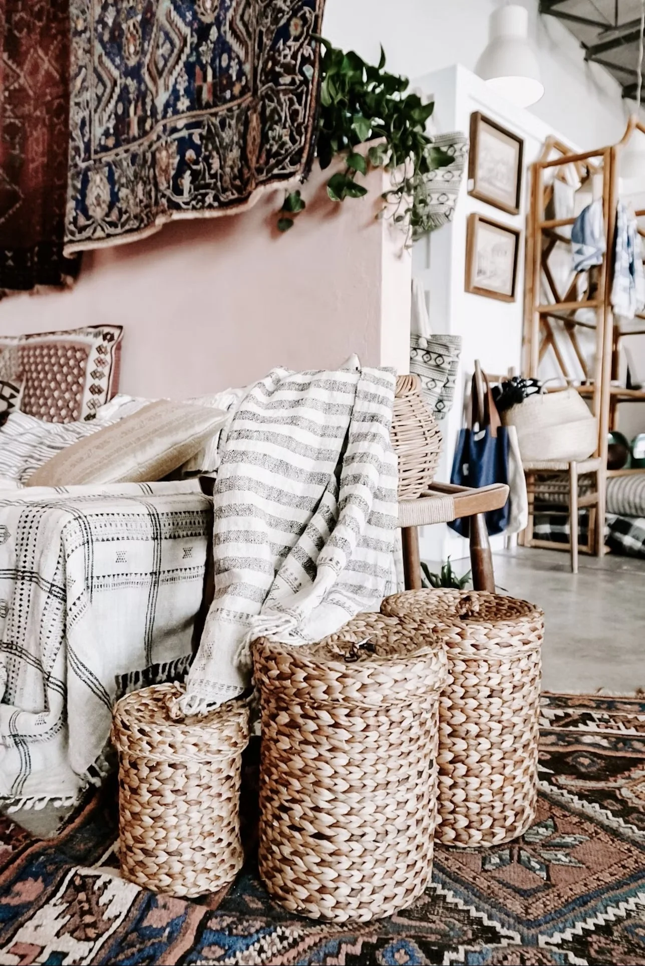
Before I draw anything, I ask one simple question: What will this textile be used for? Different uses need different strengths.
Upholstery needs to be tough and long‑lasting
Clothing needs to be soft, comfy, and washable
Wallpaper needs to handle sunlight and stay smooth on the wall
I’ve designed prints that looked amazing on a small cushion, but when I imagined them on a busy family sofa, they didn’t make sense anymore. The job of the textile decides everything else.
Aesthetics & Visual Hierarchy
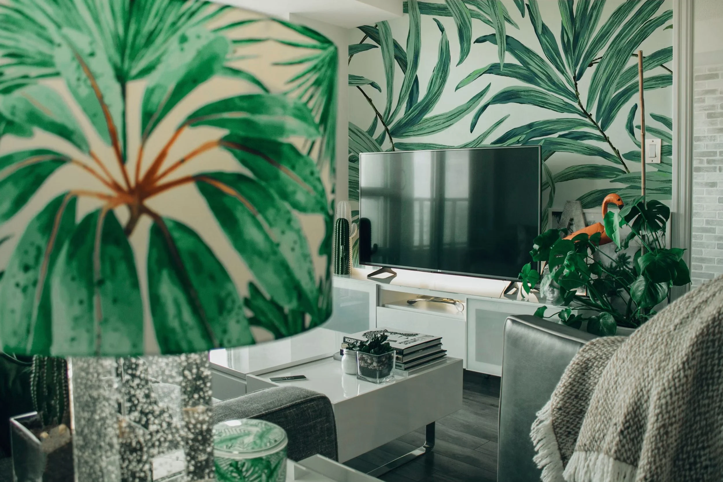
This is the “art” part of textile design—how the pattern looks and how your eye moves across it. I often print my designs at different sizes and stick them on my studio wall to see how they look from far away and up close.
Good textile design uses:
Balance
Rhythm
Clear focal points
A sense of flow
Even simple patterns feel stronger when the eye knows where to go.
Colour Strategy
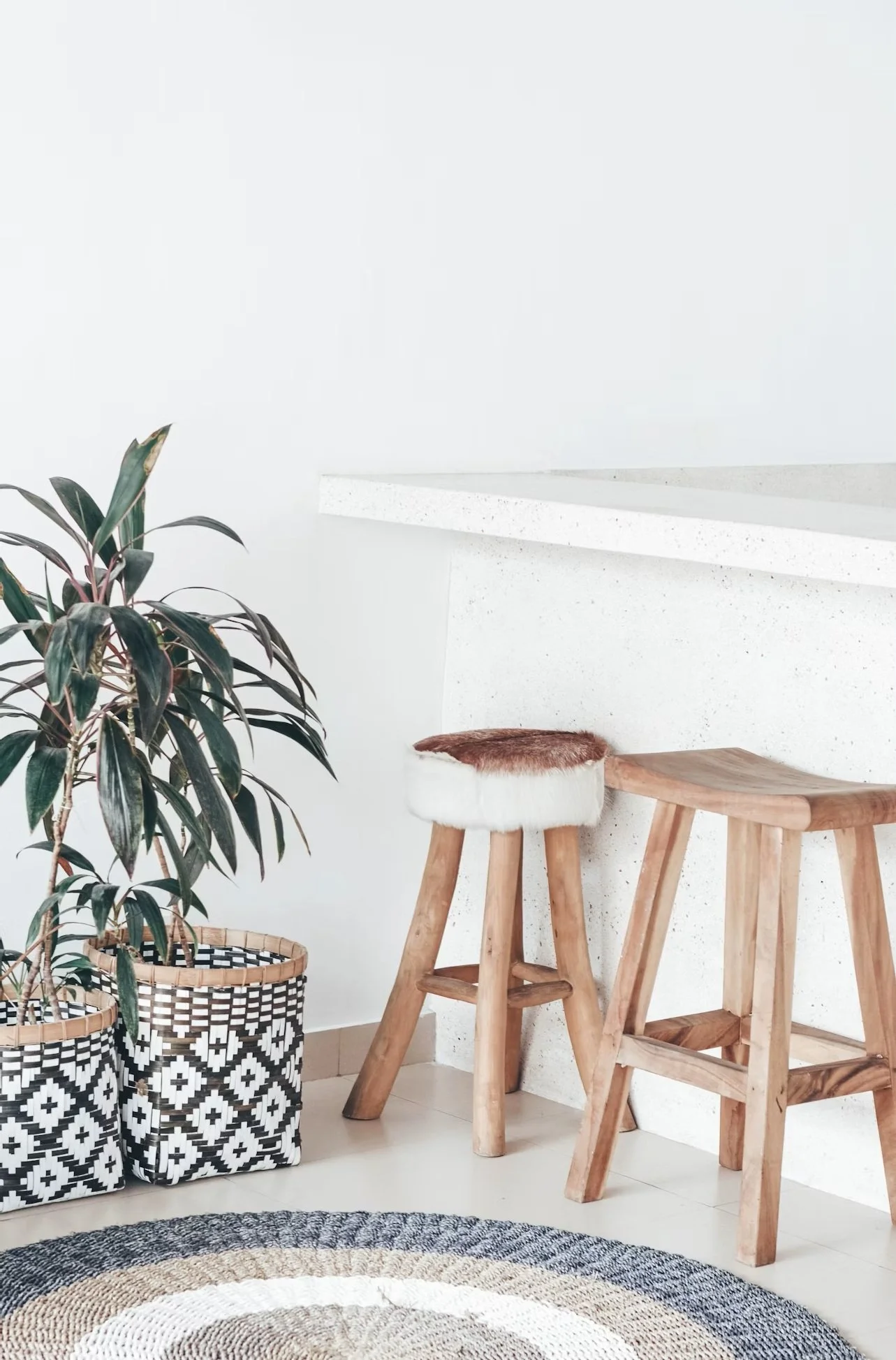
Colour is powerful, but it can also be tricky. Colours change depending on the fabric, the ink, and even the lighting in a room.
Some things I always check:
How bright or soft the colours look on different materials
Whether the colours fade in sunlight
How colours shift under warm or cool lights
I’ve seen colours that look perfect on my screen turn completely different once printed on linen or wallpaper. Testing is everything.
Scale & Repeat
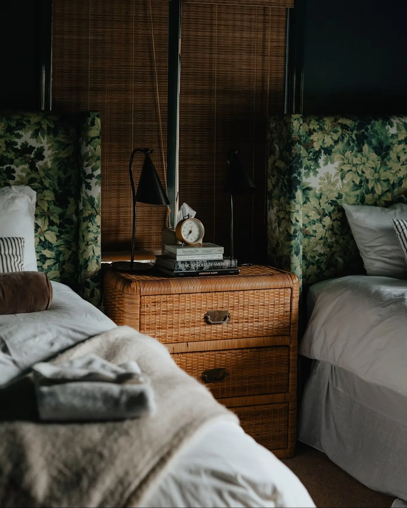
Scale is the size of the pattern. Repeat is how the pattern tiles across the fabric.
Different uses need different scales:
Small repeats work well for clothing
Big repeats look great on curtains or wallpaper
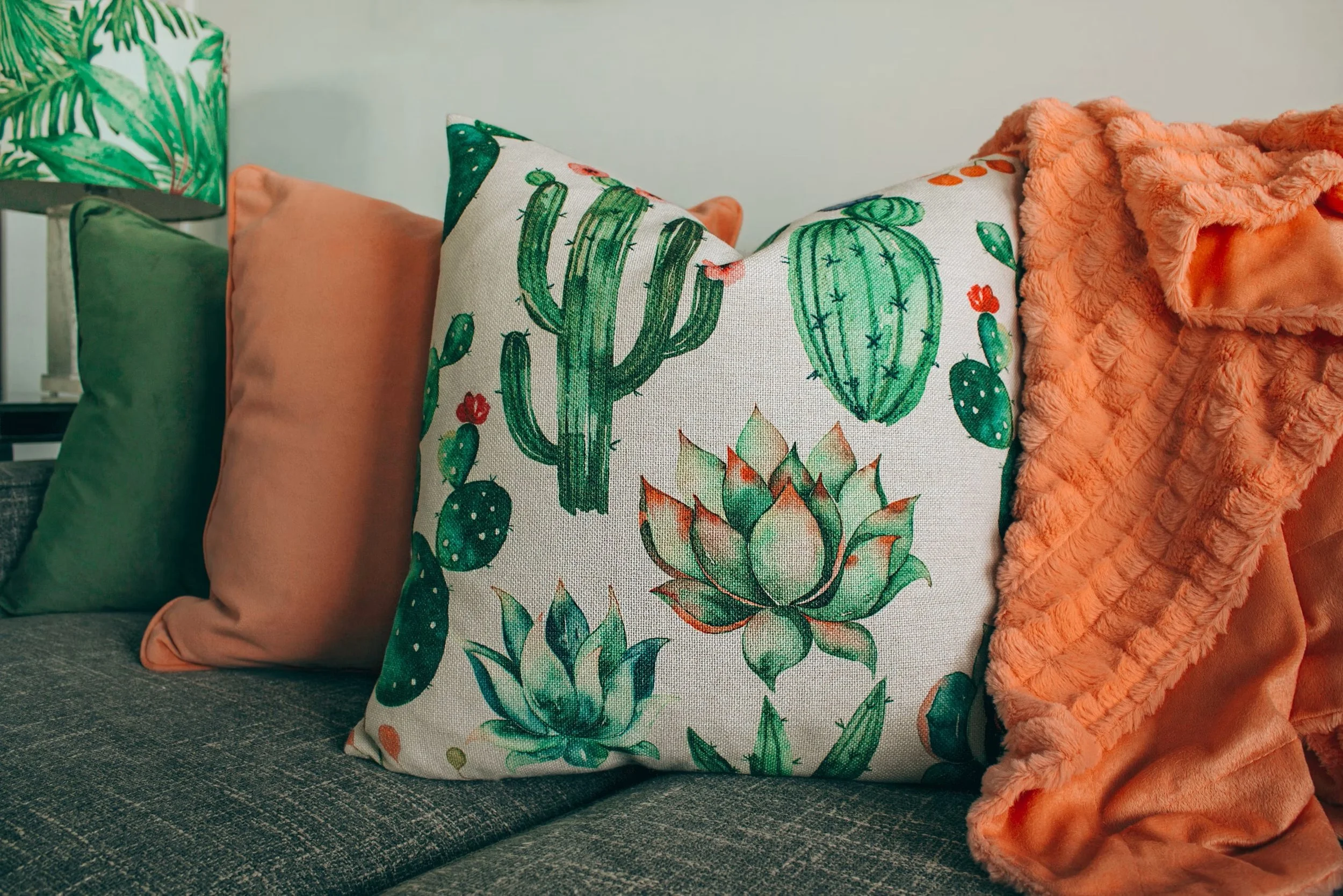
I always print my repeats at real size to see how they behave. A pattern that looks balanced on your laptop can feel too busy or too empty once it’s on a large surface.
Fabric/Substrate Choice
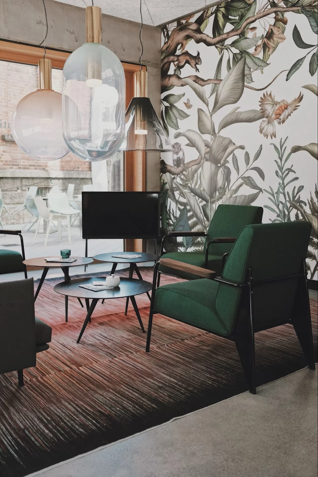
The fabric (or wallpaper base) changes how the design looks. Smooth fabrics show crisp details; textured fabrics soften edges and change the colours slightly.
Some things that matter:
Fibre type (cotton, linen, polyester, etc.)
Texture
Stretch
How the fabric drapes or hangs
Designing without thinking about the substrate is like painting without knowing what canvas you’re using.
Print Method & Production Constraints
Different printing methods have different rules. Digital printing can handle lots of colours and tiny details. Screen printing has colour limits. Rotary printing needs clean, simple shapes.
I always prepare my files carefully:
Correct colour profiles
Clean repeats
High‑quality resolution
Proper bleed
It’s not the most exciting part of design, but it saves huge headaches later.
Sustainability, Cost & Availability
More and more clients care about sustainability—and so do I. It’s important to think about:
Where the materials come from
How much waste the design creates
How easy the fabric is to care for
What happens to it at the end of its life
Cost also matters. Sometimes the perfect fabric is too expensive or not available locally, so I work with clients to find the best balance between beauty, budget, and responsibility.
Final Thoughts
Use these seven points as a checklist whenever you’re designing or reviewing a textile. They help you make choices that are creative, practical, and ready for the real world.